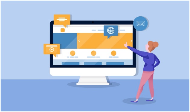
When we invest our time and efforts into organically generating leads, building brand awareness, and driving in traffic, we expect it to convert into qualifying leads and ultimately bring revenue for the business. But all the efforts go in vain if the conversion rate is low. As a marketer, you won’t feel like going that extra mile, knowing that it won’t be fruitful. And while hunting for ways to boost your conversion rate, you miss out on the basic tactic, which is working on the web design.
The impact that a web design has on the sales funnel and the traffic of the website is often overlooked. For visitors and potential customers, it doesn’t take a lot of time to develop a perception about your business just by browsing your website. Thus, your website design is much more important for conversions than you think. Web design is not merely about building a beautiful site, it also includes the functionality aspect of the site. Considering certain design principles might help you to fix your low conversion rates. Here is a list of the top 10 web design principles for better conversion rate in 2022:
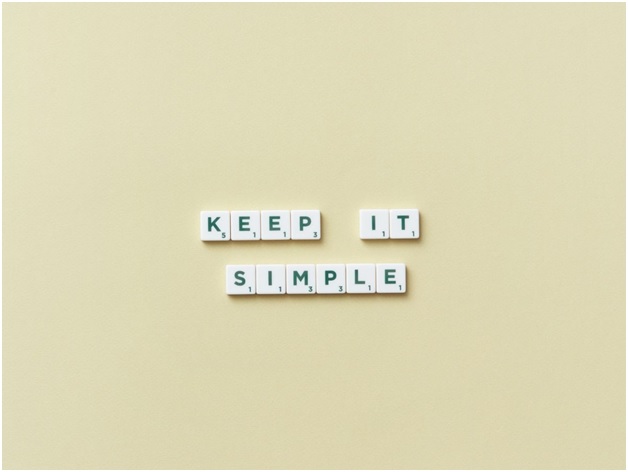
Keep It Simple
You might often get carried away with hefty web designs with too many animations and effects. But you need to think like a visitor. As a visitor would you like a cluttered website or one with an elegant look and feel? Well, you know the answer. Thus, a simple, clean, and intuitive web design is something that would help you boost your conversion rate.
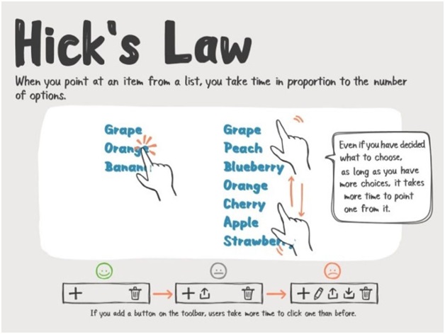
Apply Hick’s Law
This theory states that the time it takes for an individual to decide is directly proportionate to the possible choices available. If you increase the number of choices, the decision time would automatically increase and leave the visitor confused. Thus, limit the choices to make it easy for the visitors to choose and take decisions quickly.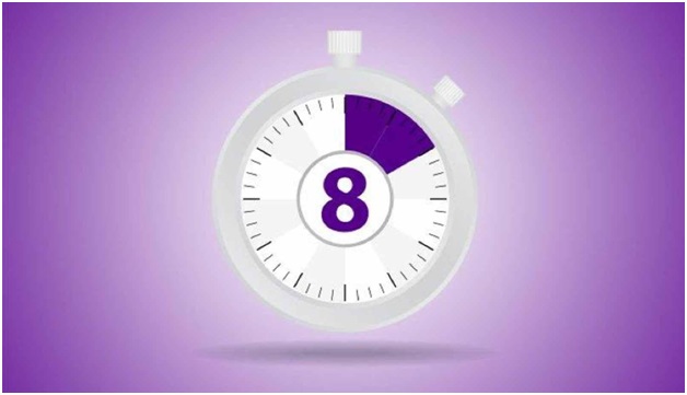
Don’t Miss The 8 Seconds Rule
Generally, people lose their concentration power just after 8 seconds. Thus, the first 8 seconds are all that matters to grab the visitors’ attention. There are multiple ways in which one can make the most of these 8 seconds, either by using a hero image or by making the sign-up tabs large to seek the user’s attention.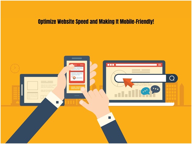
Optimizing The Speed and Making It Mobile-Friendly
Did you know that a one-second delay in mobile page load time reduces the conversion rates by up to 20%? Well, that’s something huge. As more and more people today use mobile for accessing a website, it is essential to optimize the website accordingly.
Using The White Space
Blank space or white space often leaves a negative impact on the customer. Thus, as a design company, we recommend you make the most of that white space and this would increase the chance of a conversion.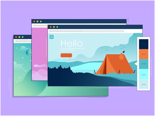
Be Particular About the Color Schemes
Often you make a mistake while playing around with colors. It is very much essential to choose the right color scheme for the site, in order to achieve the best aesthetics and attract visitors. Be wise while choosing the colors for the CTA’s, headings, etc. to make them more noticeable.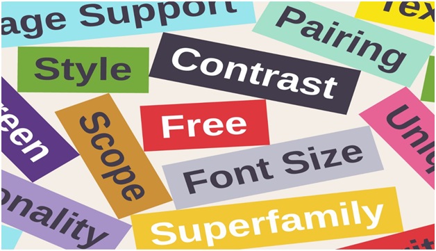
Fonts
Using complicated fonts can confuse your readers. Thus, we suggest streamlining your design to professional fonts, as it gives a sophisticated look to the website and makes it readable.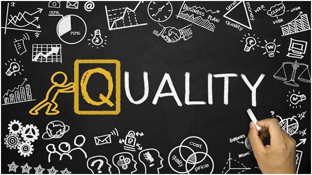
Quality Images
Unless your website is visually appealing, no matter how much effort you put into your content and design it won’t work. Using high-quality optimized images and placing them in the right place, adds to the effectiveness of the website.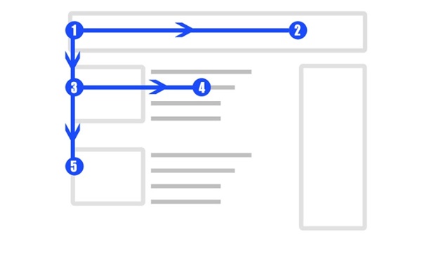
Focus On F Pattern
According to the experts, people usually scan a website in F pattern. Many of the people see the navigation bar or the logo at first. Thus, it is recommended to keep the reader’s natural behavior in mind, while displaying the information.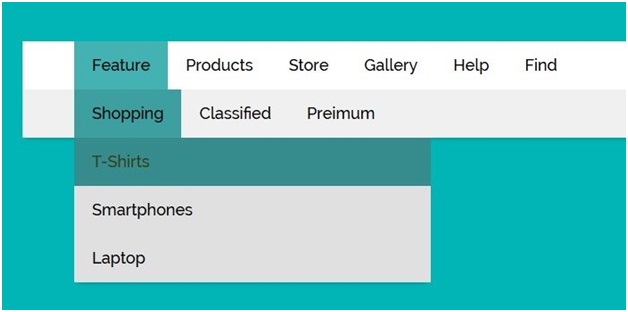
Clean Up Your Navigation and Menu
The navigation bar or the menu is something that gets the major attention. And so, it is essential to place products, contact info, about page, etc. However, if you have cluttered the navigation bar, then it might create confusion for the user. Thus, be thoughtful about your navigation bar.
Implementing the right design principles is essential for achieving a good conversion rate. However, if you need professional assistance to do so, then Technical Origami can surely help you. From web development to digital marketing, we have the skills to handle it all. For more details, you can visit our website i.e., https://tech-origami.com/ or can also speak to our experts at +442032866742 and get all your queries answered.